Simona Lo
art direction / design / illustration
Acura TSX
role: Senior Art Director/Designer
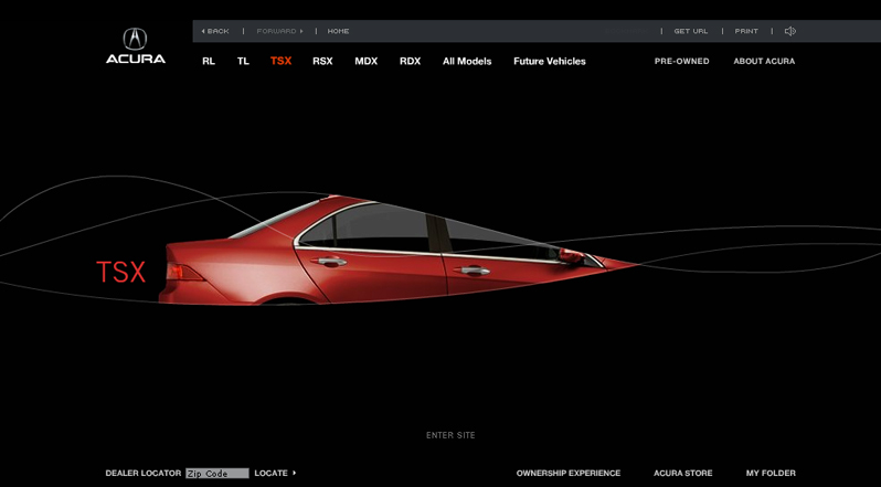
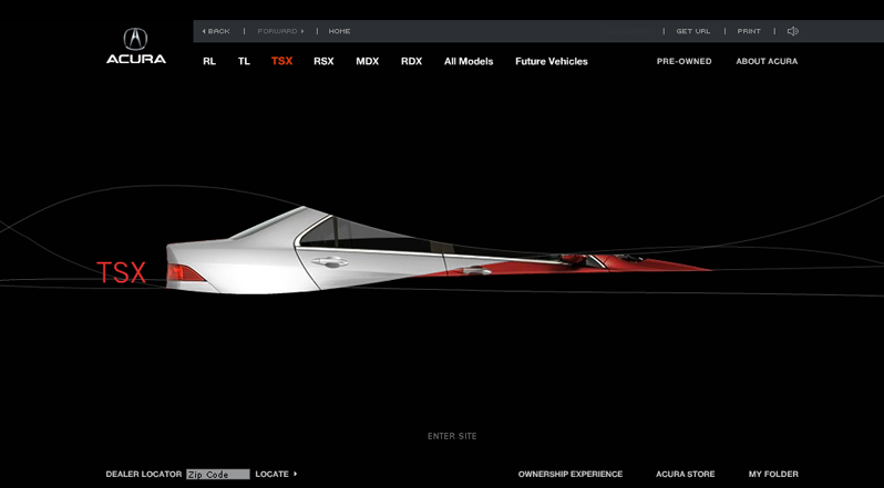
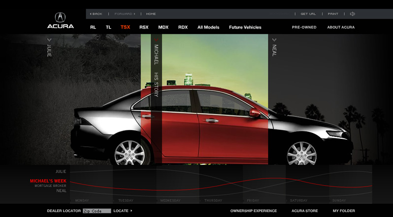
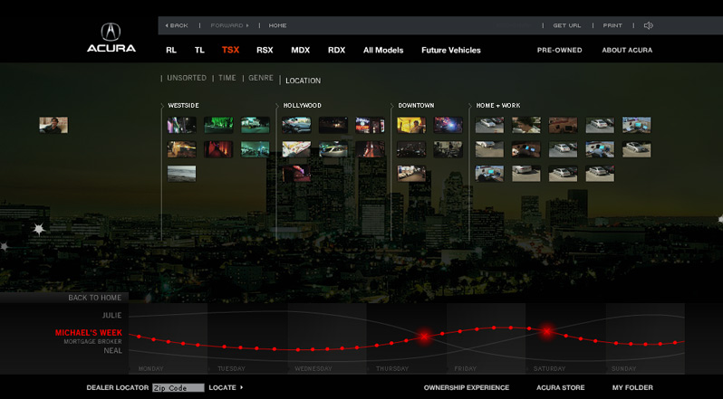
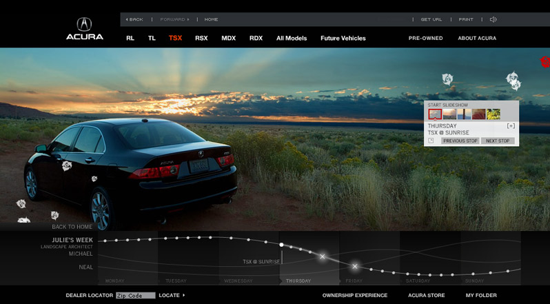
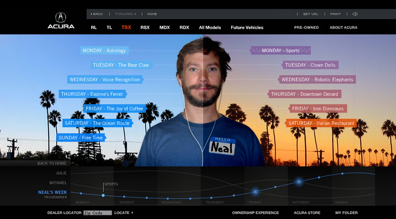
This site was created as an "experience" for the redesigned acura TSX, taking you through the lives of three individuals who all use the car in their own way. this site is a One Show Interactive Finalist.
Avon: Representatives Recruitment campaign
role: Creative Director
design: Katie Fahrenthold, Peter Hahn
copy: Alena Cason
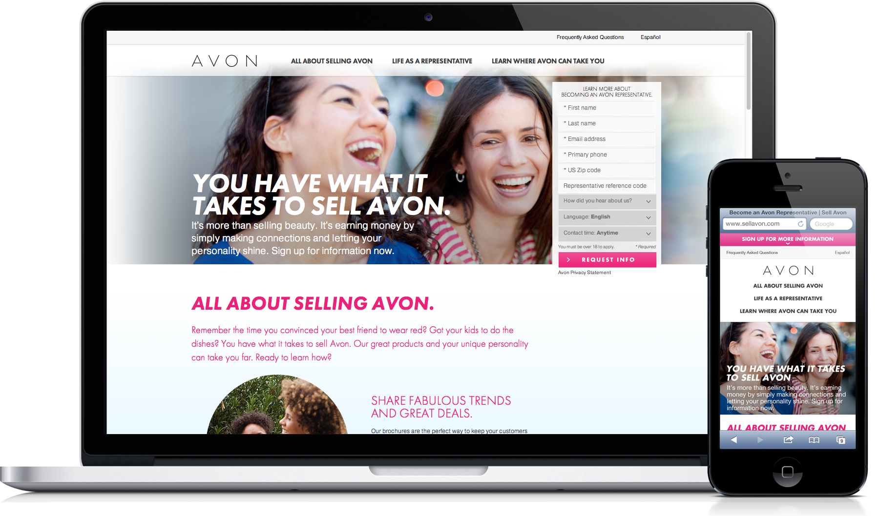
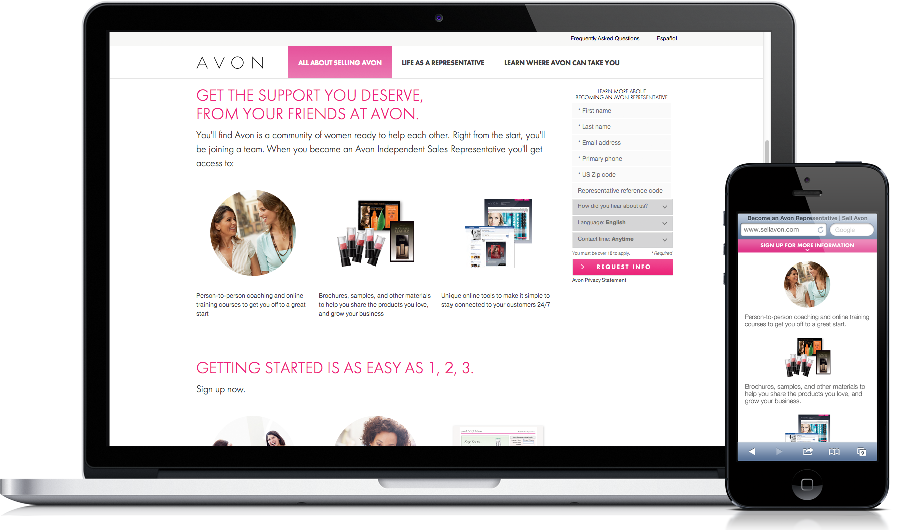
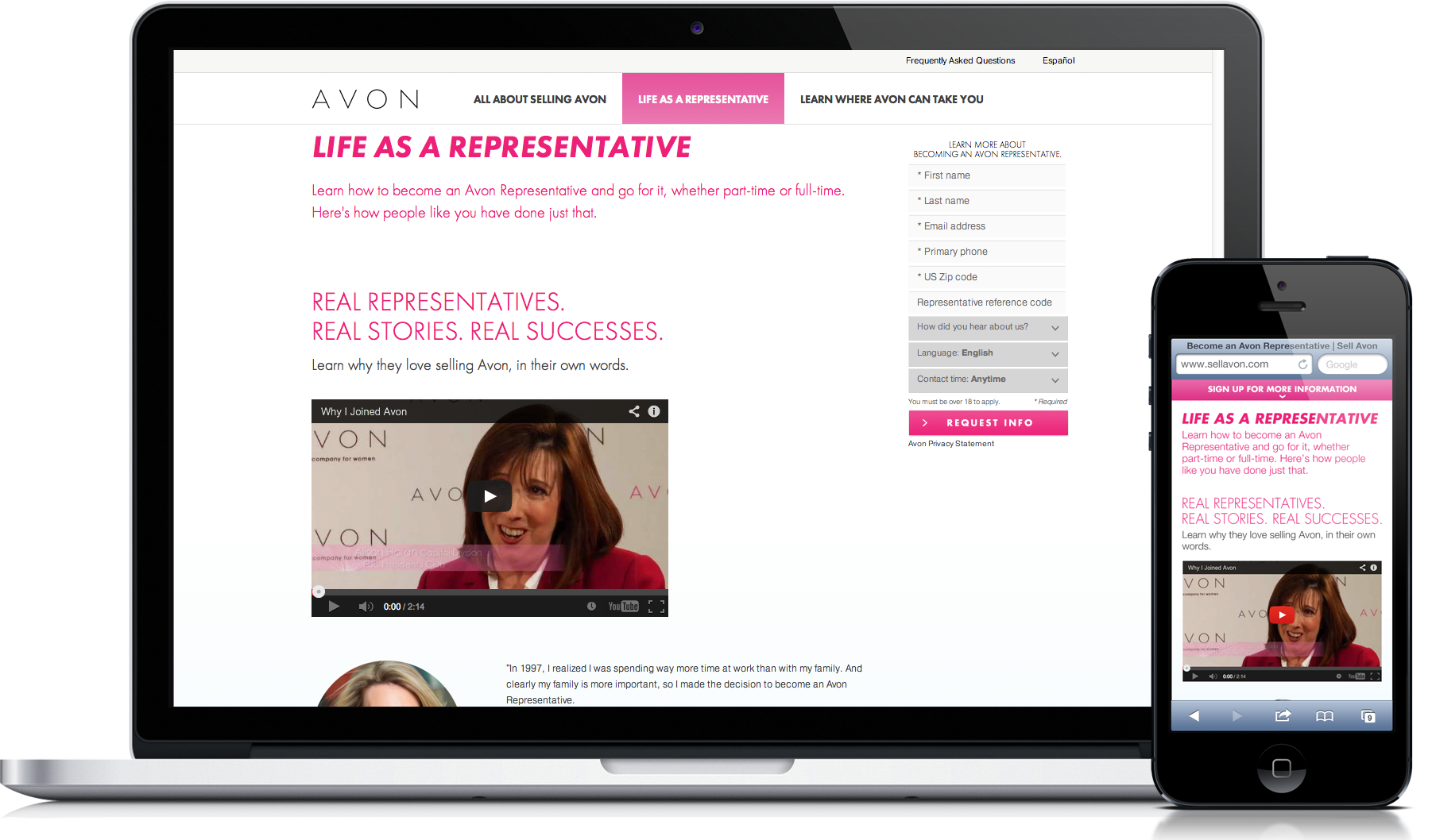
Avon has long been known for their capable representatives, and recruiting more. However in recent years, leads had declined. Why, in a troubled economy, wouldn't women want a self made opportunity to work with a great brand? Truth is, they felt intimidated by the idea of "selling," and filling out endless forms without knowing why. So we let them know that "selling" was something they had been doing all their lives, that it was inherent in every woman, and that they already had what it takes. We updated their old recruitment site, which was just a landing page with a form, to a modern, simple, responsive experience. This allowed potential recruits to both find compelling and easy to understand reasons to join, real testimonials, as well as an ever-present form that allowed them to begin the process of reaching out at any time - even on the go. It also elevated Avon's brand to feel more modern and fresh, helping to appeal to a younger generation.


Crash Movie Site
role: Senior Designer
The Oscar winning film examined the context of racism and stereotypes of characters whose lives ultimately entwined in Los Angeles. It had a section where the user could drag and drop multiple emotional words anywhere onto one photograph, which would then generate a graphic/colour and would ultimately result in an individualistic "art piece." this site was awarded "merit in consumer websites" in the HOW Magazine's 2006 Interactive Design Annual magazine.
Mercedes E-Class launch site
role: Senior Art Director/Designer
We created an experience to launch Mercedes' launch of their new E-Class sedan. Video vignettes were made around the vehicle's key new design, technology, safety and luxurious features. The launch included both a sedan and coupe, each had their own environment and treatment that was subtle in the environment they were placed in.
Nextel South America
role: Senior Art Director, Designer
This is a concept that I helped put together for Nextel South america. The idea is that it needed to reflect the brand, which in Latin america is more playful, while maintaining usability and modularity so that both English, Portuguese and Spanish could be used. Aside from the language swapping, promotions, phones and offers and features all had to be interchangeable.
Another notable feature was the "Assistant" which was a module on the site that allowed quick access to live chat help, smart search, account overview and bill pay - along with a customizable customer account page. This thinking helped win the account and the visuals were so well received that actual site design is being based off of them.
Pangea Day
role: Art Director, Designer
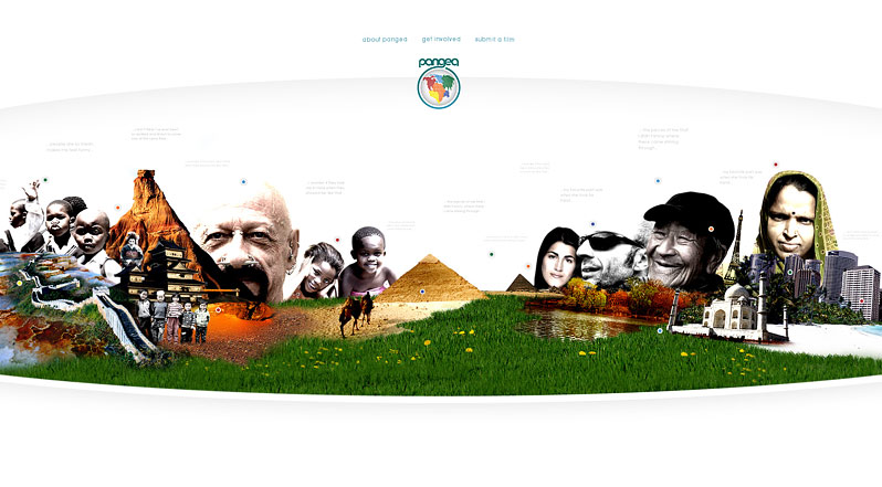
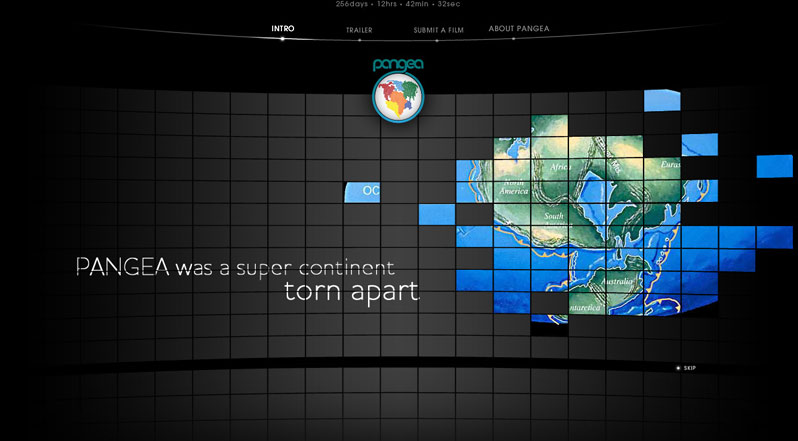
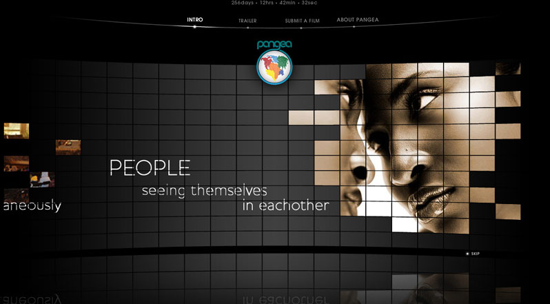
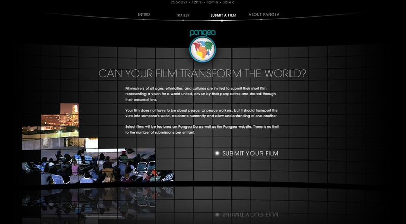
Some nifty early concepts for a simultaneous global film festival that was the realization of TED Prize winner and documentary film maker Jehane Noujaim.
Terra Sonora design
role: Senior Art Director, Designer
Terra Sonora is the music listening, finding, and purchasing area of Brazil (and South America's) largest portal site. Here, music is sortable by popularity and viewable in tag cloud or list mode. Its a whimsical way to discover and play music - basically a Pandora meets MySpace music with the purchase ability of Amazon- on one site. Really fun stuff to have worked on. (the 2 week trip to São Paulo to finish this out wasn't bad either)
School Specialty Platform
role: Creative Director
ACD: Scott Galbraith, Kai Pham
design: Peter Hahn, Stefan Georgi, Josh Leavitt
www.schoolspecialty.com
School Specialty is an education company providing products, programs and services that enhance student achievement and development.. School Specialty's family of brands serves more than 116,000 schools throughout the U.S. and Canada, with a range of more than 100,000 products. What they needed was a re-thinking of how they were selling to, and communicating to educators. They have to cater to various audiences, grade levels, requirements and needs. Our solution was a highly dynamic system that allows for more intuitive product groupings, thought leadership content, and more intelligent cart management. In addition, it is a built on a responsive platform, allowing a single hub for all of the educator's devices.
Skeleton Key movie site
role: Senior Designer
This site is a blend of experiential and accessible, utilizing rich, developed environments and robust sound design to create a sense of suspense and general creepiness.
STARR Platform
role: Creative Director
design: Peter Hahn, Josh Leavitt
www.starrcompanies.com
Starr Companies is a leading global insurance and investment company with a broad offering of property, casualty, and accident & health insurance products, services and specialty coverages. Their online presence and CMS platform were far from being nearly as sophisticated as their offerings. Working closely with clients, we developed an updated responsive site that helped modernize their brand, and even their selling process. It's a solution that's also flexible enough to support their needs years into the future.
TDA Bank pitch concepts
role: Associate Creative Director/Designer
design: Kai Pham, Stefan Georgi, Sheila Alhmadi
These are some mock ups from a proposal to address TD Ameritrade's online experience and to help not only generate awareness about their breadth of offerings, but also create a sense of usability and friendliness. Working with strategy teams, the idea was developed to create an agile platform from which TD Ameritrade could easily update templates, swap content, create custom pages and gather data on the fly - providing them with a dashboard view of site performance. On the front end, we explored different visual applications to the same template to show the flexibility of the platform as well as showcase the many ways we could interpret the brand digitally.
